
I’ve built and rebuilt a lot of senior living sites. Big campuses. Tiny board-and-care homes. Memory care. Independent living. You name it.
I’ll share real builds I did, what I used, and what moved the needle. I’ll also tell you what flopped. Because some things did flop. And that’s fine. We learn. We tweak. We test again.
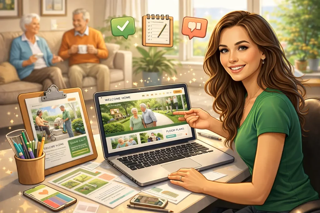
First, a quick note from my heart
My grandma had shaky hands and tired eyes. She loved stories, large print, and clear buttons. She hated tiny gray text and fancy sliders. So I keep her in mind. If she can read it fast, we’re good.
For even more granular, data-backed ways to polish a senior-living site, I often point peers to these six quick optimization tips—the list aligns closely with my own trial-and-error notes.
That simple rule saved me a lot of time.
For an even broader look at web layouts that balance clarity with conversion, take a peek at the resources on Design Web Magic — their case studies line up closely with the wins (and lessons) you’ll see below.
Their detailed teardown of a recent senior-living redesign in particular echoes many of the typography, accessibility, and conversion tweaks I’ll cover.
Build 1: WordPress for a midwest assisted living (120 beds)
This one ran on WordPress with the GeneratePress theme. I used Elementor for a few layout blocks, but kept it light.
- Hosting: Kinsta
- Speed tools: Cloudflare, WP Rocket, ShortPixel
- Forms: Gravity Forms with strict field rules (no health details)
- Calls: CallRail for tracking
- Schedule tours: Calendly
- ADA checks: Siteimprove monthly scans
What I changed:
- Big type. Body at 18px. Line-height at 1.6.
- High contrast. Navy text on warm white. Buttons in gold or teal.
- Sticky phone bar. It followed you down the page on mobile.
- Clear nav labels: “Care,” “Floor Plans,” “Pricing,” “Book a Tour,” “Contact.”
- Short forms. Name, phone, email, preferred visit time. That’s it.
I cut the big hero video. It looked nice, sure. But it slowed the site and distracted people. I used a still photo with real residents instead.
What happened:
- Mobile speed jumped from 41 to 89 on PageSpeed.
- Calls went up. About 28% over 90 days.
- Form spam dropped after I added a simple math check.
What I’d do the same:
- Keep type big.
- Keep the phone number in the header and footer.
- Use real photos. We spent one afternoon with an iPhone and window light. Honest faces beat stock smiles every time.
What bugged me:
- Elementor can bloat pages if you get fancy. So I used it only where needed. The rest was native blocks.
A small side note: we didn’t collect health data. If a family asked about medication help, we moved that talk to the phone, not the form. If you must collect sensitive info, use a vendor that signs a BAA, like Formstack’s HIPAA plan or Paubox forms.
Build 2: Webflow for a memory care campus in Arizona
This team wanted motion. I wanted calm. We met in the middle.
- Platform: Webflow
- Virtual tour: Matterport
- Live chat: Smith.ai (limited hours, real humans)
- Heatmaps: Hotjar
- A/B testing: VWO
- CRM: Yardi Senior (we used a webhook through Zapier to push leads)
Design choices:
- No auto-play. No carousels. The hero image stayed still.
- I used plain language. “Memory care you can feel. People who listen.”
- Buttons had large hit areas (44px+).
- Every image had alt text.
- I built a “Family Hub” page with meal plans, an events calendar, and a printable guide.
We did a quick card sort with Optimal Workshop. It showed people looked for “Pricing” more than “Amenities.” So I moved “Pricing” into the top menu and added a range, not a secret number.
Results after 60 days:
- Bounce rate dropped by 18%.
- Tour requests went up by about 34%.
- Chat helped at night. After 7 p.m., families asked short, urgent questions. “Do you have space?” “Can we visit Saturday?” That’s the stuff that matters.
What bugged me:
- Multi-location content in Webflow got messy. I fixed it with Collection templates and a simple city filter. Still, WordPress handles multi-location a bit easier.
Build 3: Wix for a tiny board-and-care in Fresno (fast and cheap)
Sometimes you just need a clean site fast. This home had six beds and a small budget.
- Platform: Wix
- Tour booking: Wix Bookings
- Accessibility: Wix Accessibility Wizard
- Photos: iPhone 13, noon light, no fancy edits
Timeline: two weeks.
Cost: under $600, all-in with a year of hosting.
I made one long page with anchor links. It loaded fast enough, though not as fast as my WordPress build. On older Android phones, it felt a bit heavy. I trimmed image sizes and cut a gallery. Problem solved.
Leads:
- They got six solid leads in the first month. Three tours. One move-in. For a small home, that felt big.
What seniors and families tell me (and what they don’t)
They want:
- Clear pricing ranges
- Floor plans they can print
- Real pictures of rooms and bathrooms
- A map with drive times
- A direct phone number, not a maze
They don’t want:
- Sliders that move on their own
- Tiny gray type
- Password walls for simple brochures
- Five pop-ups in a row
Little copy tweak that helps:
“Ready to talk? We’re here.”
Simple. Kind. Human.
Accessibility that actually helps
I aim for WCAG AA, but I keep it plain:
- Contrast 4.5:1 or better
- Big tap targets
- Visible focus states
- Keyboard navigation works
- Every form field has a label
- Helpful error text (“Please enter a 10-digit phone number”)
I test with NVDA on Windows and VoiceOver on my phone. I also run automated scans with Siteimprove or Monsido each month. Tools catch patterns. People catch feelings.
Content that earns trust
This isn’t hotel marketing. It’s care. Tone matters.
What I publish:
- “What is the real cost of assisted living?” (with a range, not fluff)
- “Memory care vs assisted living: a simple guide”
- “What to bring on move-in day” (a printable checklist)
- Monthly menu highlights with real photos
- Staff spotlights with short quotes
- Spanish pages when the area needs it
I keep blog posts short and helpful. If a family can read it on a phone while sitting in a parking lot, I did my job. Need proof that simplicity converts everywhere? Even no-nonsense dating platforms strip the journey down to one or two taps; a concise breakdown of Tinder’s friction-free hookup flow reveals how removing every extra click boosts sign-ups—a principle you can borrow for tour forms and “Book Now” buttons.
Insights from other service industries matter too; Design Web Magic’s candid post about hiring a lawn-care web design team is a sharp reminder that transparent copy and honest expectations resonate with audiences of any age.
Local SEO that doesn’t feel gross
- Google Business Profile: fresh photos, weekly updates, correct hours
- Schema: LocalBusiness plus the right subtype (AssistedLivingResidence or NursingHome where it fits)
- FAQs on the page with FAQ schema
- Consistent name, address, phone across listings
- UTM tags on ads and referral sites
- Review requests by text after a tour (only when it feels right)
I track goals in GA4: calls, form sends, tour clicks, chat starts. I also listen to calls in CallRail to spot problem points. One time I heard, “I couldn’t find pricing.” We fixed that the same day.
Photos: the simplest win
We shoot on-site. Window light, soft colors, real people. I ask staff, “What room do families love?” We go there. We show details. Handrails. Grab bars. Garden paths. The little things calm fears.
If you need design inspiration, the curated gallery of examples in this roundup of the best senior living website designs is a great place to spark layout and color ideas before you dive into wireframes.
I label photos with simple names: “studio-floorplan,” “sunroom,” “accessible-shower.” It helps search. It helps humans.
My favorite stack (right now)
- WordPress + GeneratePress + core blocks (Elementor only if needed)
- Kinsta hosting +